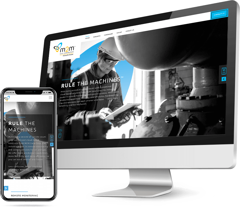

How do you make a data company's web presence as forward-thinking as their products, yet still echo Caterpillar, the Fortune 100 company who recently bought them?
Highlight M2M's amazing capabilities through modern design and functionality while humanizing the benefit to the end-user.
To merge the two brands visually we incorporated secondary colors from within the Caterpillar color palette and placed a focus on modern typefaces. We then introduced large format imagery to humanize the benefit.
With clean design, simplified functionality and maximum whitespace, the website's user experience was in itself a demonstration of the experience of using M2M's products.
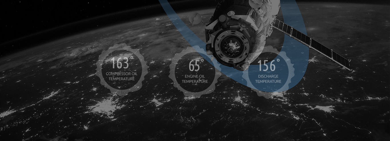
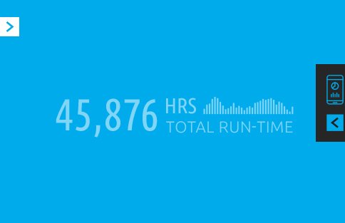
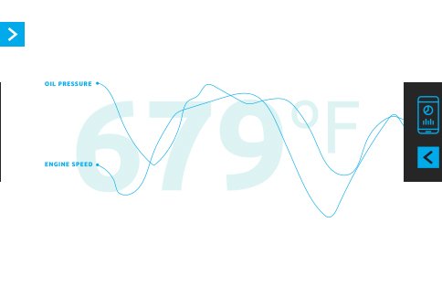
Love created a custom icon system for easy navigation and simplification of complex concepts.
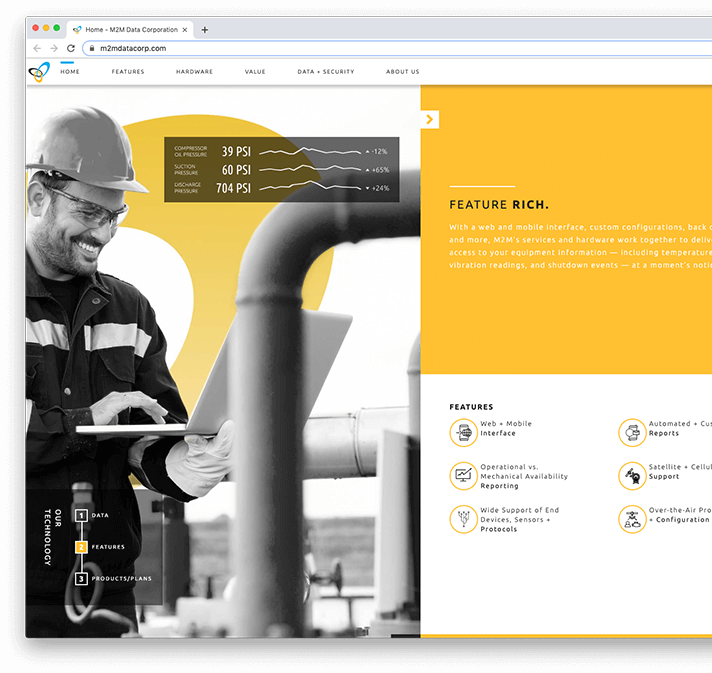

With a combination of minimal copy, curated content, bold colors, and clever uses of animation, Love created a user experience that conveyed simplicity and intelligence.
Love created a photo library depicting oil field workers seamlessly interacting with technology. But we also incorporated a dynamic and consistent graphical element, inspired by the M2M logo, into every photo. The graphic conveyed a sense that the data is empowering the person to do more, with ease.


Digital strategy, creative,
animation, development.
Thanks for reaching out. we'll be sure to be in contact soon to follow up.
In the meantime, follow us on social media to keep up with all of our shenanigans.