
Introduce a new bank with old school values in a city with a bank on every street corner.
Give the bank a brand and identity true to the values of its founder, then make it look unlike any other bank in Texas.

No one would expect a bank to use an 1800's-era Texas navy cutter as its symbol. But the ship conveyed Texas heritage and a steady vessel in rough seas, a metaphor which can be easily by applied to banking today.


The idea was inspired by the presence of Texas Navy ships on all Republic of Texas currency, otherwise known as Redbacks. The mark also forms arrows signifying forward and upward movement.

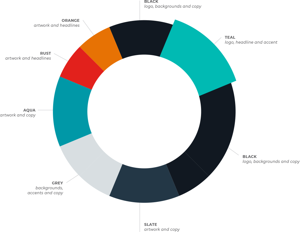
We wanted to tie in a connection to the Gulf in both the name and location of the bank. A pallete of teal, black, slate and a few complimentary shades creates a modern and sleak aesthetic that is unique in a banking industry oversaturated with blues and reds.


Our symbolism in the logo is partnered with a unique wave pattern created as a branding element. The wave pattern represents both the wind to fill the sails and the water being navigated. With subtle use and a unique color pallete, we achieve a modern brand with a nod to the elements of the Gulf Coast without being overwhelmingly nautical.


Love created a custom website to match the unique and fresh brand of Gulf Capital Bank. We aimed to create a website that was both a refreshing design in a landscape of templated bank sites and had an ease of use for viewers to navigate to the page they were searching for.


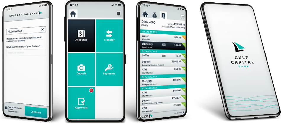
We also incorporated our fresh new look into a mobile app experience for the bank's customers to access their banking on the go.

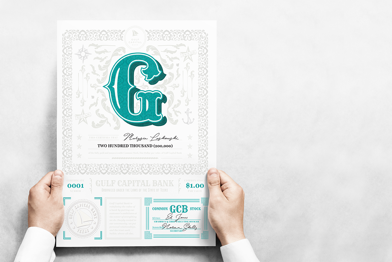
We brought back elements from the Republic of Texas currency and wove our nautical theme into the design of the bank's stock certificates.

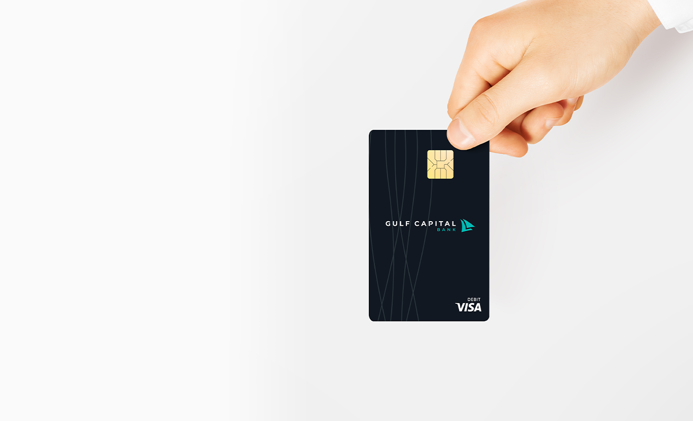
We stayed true to our brand in the debit card design as well.
Strategy, digital strategy,
creative, development.
Thanks for reaching out. we'll be sure to be in contact soon to follow up.
In the meantime, follow us on social media to keep up with all of our shenanigans.